6 easy ways to customize your responsive Matched content unit quickly
Matched content is a free recommendation tool that offers you a simple way to promote your content to your site visitors. Learn how to add matched content ads and adsense matched content customization. Different matched content formats and layouts.
Do you want to give a good shape on your responsive Matched content unit to increase user engagement?
If you monetize your site with matched content ad, then it can also affect your metrics through increasing impression RPM. As a result, your matched content income will rise.
AdSense Matched content earnings have small contribution in your overall AdSense income but it plays significant rule to boost user connectivity and income.
You are using AdSense matched content from the beginning but you can't customize matched content ads, because it gives you less control over the ad unit in AdSense ad customization option.
And many of us not aware about the customization feature without violating AdSense program policies.
Adsense matched content customization is very easy and you would be happy to know that now there are 6 layout styles we can use to change the responsive Matched content unit layout quickly by adding simple parameters to your existing ad code.
To do this you don’t require any additional coding knowledge. And matched content perform well in both amp and non-amp sites.
By default matched content format shows like blogger related post widget and many blogger use AdSense matched content unit as an alternative of “Related post” widget and many blogger removed previous related post widget after adding adsense matched ads, because it affects the overall page loading speed.
This is not only growing the user engagement but also improve adsense matched content earnings noticeably.
Many users often complain that adsense matched content not showing in their blog according to their desire size and shape. As a result they stop using this fantastic Google adsense ad unit.
Benefits of using customize matched content ads
There are many advantage of using matched content but if you can do little tweak then total ad impression will grow rapidly. But what exactly user will get benefited from this custom layout?
They can get benefited from customized responsive Matched content unit in following ways:
- Customization will enable you to adjust ad unit with any theme layout and width.
- User can specify the number of rows and columns in custom matched content ad unit.
- User can show up to 30 posts recommendation in a single ad unit.
- User can control the layout and number of recommendation of ad unit.
- It will enhance user experience and more visitors will hookup with your related blog content.
- You can also use it as an alternative of related post widget as well as random post widget in your blog sidebar.
- It can increase your AdSense earnings and Blog page views.
And so on.
It seems to me that if you don’t user matched content then you are missing a best feature of AdSense that could change your overall experience.
What is Matched Content?
This is an AdSense’s free recommendation tool and new ad feature to offer site visitors to promote content. This tool shows more relevant content to Blog readers that increase interest to view more content of a site.
The ultimate goal of this tool is to increase website’s page views, reader’s engagement, ad impression and ad revenue.
According to AdSense data scientist this feature helps the webmaster to
- Increase Number of pages viewed by 9% on average.
- Increase time spent on site by 10% on average.
Matched content unit always display relevant content within your site including ads that easily grab the visitors attention. As a result it increases overall page views and time spent on site.
How to check matched content adsense eligibility?
First of all you have to check your site either it is ready for Matched content or not eligible to use it. If your site is eligible for matched content, then it will show the status “Ready” in your AdSense account under matched content site settings.
To check the status please follow the below steps-
To check the status please follow the below steps-
Step #1: Sign in to your AdSense account.
Step #2: Click “Sites” tab to expend options from left menu and select “Overview”.
Step #3: If your website is ready for AdSense matched content then you will see the status “Ready” in green color font.

This means your site is eligible to use AdSense matched content in authorized website. For example: if you got approval of matched content for example.com then use only on that site. Do not use it another site, because your site can get penalty for unauthorized use.
How to Create a Matched content unit?
Now we will create an AdSense matched content ad unit. This is pretty simple process and any novice blogger can create for their Blog and website. However before creating matched content unit you must ensure that are your site is eligible to place matched content ad unit.
To create a Matched content unit please follow the below steps-
Step #1: Sign in to your AdSense account.
Step #2: Click Ads to expend options from left menu and select Ad units.
Step #3: Click +New ad unit button to create new ad unit.
Step #4: Select “Matched Content” card from 4 options.

Step #5: Give your Matched content unit a name on “Ad unit name” fields e.g. my matched content.
Step #6: You will see the preview of your Matched content unit. In right side click “Ad options” to expend and click to enable “Monetize with Ads”.
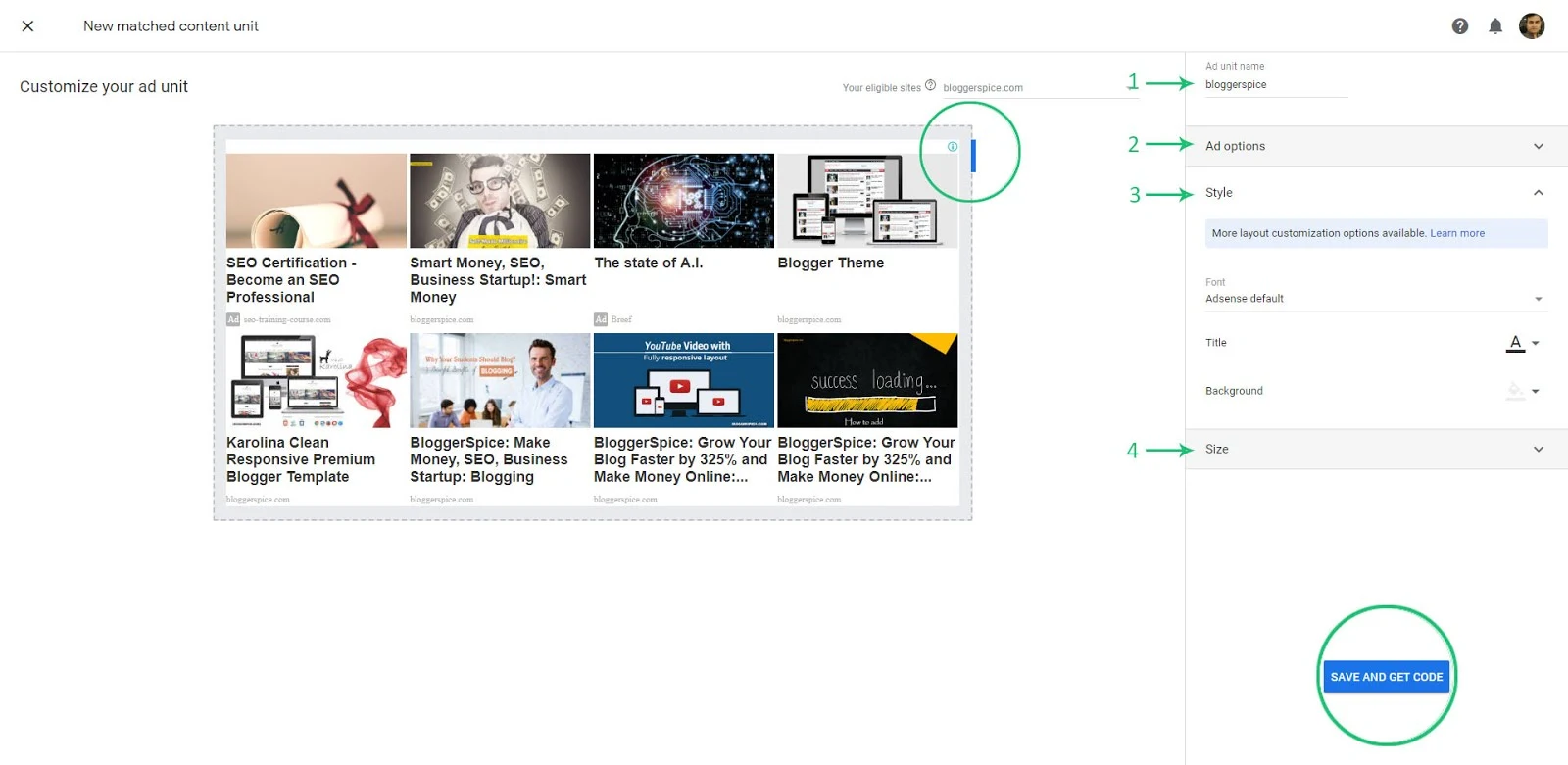
Step #7: Click "Style" to expend the section, changes the style of your Matched content unit to match your site. You can select Font, Title color and background.
Step #8: In the "Size" section, choose an ad size that fits your layout. Recommended option is “Responsive”, because it can adjust with any layout.
Step #8: Finally Click “Save and get code” button for matched content ad unit script.
The script will be look like below
<script async src="//pagead2.googlesyndication.com/pagead/js/adsbygoogle.js"></script>

<!-- bloggerspice -->

<ins class="adsbygoogle"

style="display:block"

data-ad-client="ca-pub-xxxxxxxxx"

data-ad-slot="1234567890"

data-ad-format="autorelaxed"></ins>

<script>

undefinedadsbygoogle = window.adsbygoogle || []).pushundefined{});

</script>
Save the script in a notepad, because we need that code for further customization.
The recommended place for Matched content unit is post footer area or sidebar. If you place the default script on post footer section then generally 4 post recommendations will display but if you place the ad code in your blog sidebar then it will display up to 13 post recommendations.
But if you want to use Matched content unit as “Related post” widget then simply place this at the end of each blog post, I mean in post footer section. To learn about placing system in Blogger theme please visit my another tutorial by using below recommendation.
Do you want to learn How to add AdSense matched content? Then Please visit below article.
How to customize your responsive Matched content unit?
By inputting different layout like parameter
data-matched-content-ui-type you will able to control the matched content unit and change the arrangement. You can follow anyone out of 6 easy ways to customize your responsive Matched content unit quickly. Those are as follows: - Display Image and text side by side with specified Row and column
- Display Image and text side by side with card with specified Row and column
- Display Image stacked above text
- Display Image stacked above text with card
- Show Text only in ad unit
- Show Text with card in AdSense ad unit
1. Display Image and text side by side with specified Row and column
In this layout style you can display Blog post image and title side by side. This means the total 4 or 5 blog post will display in 1 column and post title will display at the right side of the post recommendation. You can see the below image for example-

To make your adsense match content unit like above just you have to add script like below
<script async src="//pagead2.googlesyndication.com/pagead/js/adsbygoogle.js"></script>
<!-- bloggerspice -->
<ins class="adsbygoogle"
style="display:block"
data-ad-client="ca-pub-xxxxxxxxx"
data-ad-slot="1234567890"
data-matched-content-ui-type="image_sidebyside"
data-matched-content-rows-num="4"
data-matched-content-columns-num="1"
data-ad-format="autorelaxed"></ins>
<script>
undefinedadsbygoogle = window.adsbygoogle || []).pushundefined{});
</script>
In your ad script you have to add additional 3 line parameters like below:
data-matched-content-ui-type="image_sidebyside"
data-matched-content-rows-num="4"
data-matched-content-columns-num="1"
Here to display image side by side below parameter used
data-matched-content-ui-type="image_sidebyside"
To display 4 recommendations in row used below parameter. If you want to display 5 or 8 posts then simple replace 4 with any number. But remember that you can display maximum 30 recommendations. If you add more than 30 then your ad unit will display blank.
data-matched-content-rows-num="4"
To display 4 recommendations in row used below parameter. If you want to display the ads in 2 or 3 columns then simply change the 1 with 2 or 3 etc.
data-matched-content-columns-num="1"
This is the simple trick to display image side by side in 1 or 2 columns.
2. Display Image and text side by side with card with specified Row and column
This layout is same as first one but little bit different. This layout style will display 4 recommendations in 1 column but the post image and text will appear alongside each other within a card. You can have a look at the below screen shot.

To make your adsense match content unit like above, then simply add the below parameter with your existing ad code.
data-matched-content-ui-type="image_card_sidebyside"

data-matched-content-rows-num="4"

data-matched-content-columns-num="1"
Here to display image side y side with card you have to add below line.
data-matched-content-ui-type="image_card_sidebyside"
And to display 4 recommendation with card added below line
data-matched-content-rows-num="4"
To display four recommendations in 1 row used below parameter. If you want to display it in more column then simple alter the 1 with 2 or 3.
data-matched-content-columns-num="1" 3. Display Image stacked above text
Under this style you will able to display image stacked at the top and post title will appear below the image. You can have a look at below screen shot.
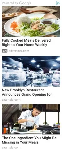
The ad script for Image stacked is like below:
<script async src="//pagead2.googlesyndication.com/pagead/js/adsbygoogle.js"></script>

<!-- bloggerspice -->

<ins class="adsbygoogle"

style="display:block"

data-ad-client="ca-pub-xxxxxxxxx"

data-ad-slot="1234567890"

data-matched-content-ui-type="image_stacked"

data-matched-content-rows-num="3"

data-matched-content-columns-num="1"

data-ad-format="autorelaxed"></ins>

<script>

undefinedadsbygoogle = window.adsbygoogle || []).pushundefined{});

</script>
To show image stacked you have to add below parameter.
data-matched-content-ui-type="image_stacked"
Similarly to display 3 recommendations 3 row has been selected.
data-matched-content-rows-num="3"
To display 3 recommendation in 1 column below parameter has been set. To increase the numbers of column alter 1 with 2 or 3.
data-matched-content-columns-num="1" 4. Display Image stacked above text with card
This is similar layout style of Image stacked but additionally it will display post recommendations within a card.
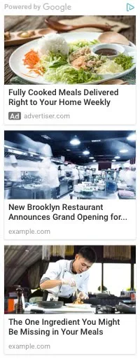
To add this style to your matched content, please just add below parameters in your existing ad unit.
data-matched-content-ui-type="image_card_stacked"

data-matched-content-rows-num="3"

data-matched-content-columns-num="1"
You can do the further customization by changing number of row and column respectively.
5. Show Text only in ad unit
If you want to display text only in your matched content ad unit then this layout style is suitable for you.
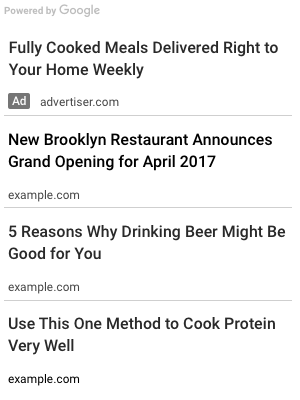
Many blogger wants to keep ad unit clean and simple, so they prefer Text only parameter to use in their ad unit. For text unit the ad script will be look like below:
<script async src="//pagead2.googlesyndication.com/pagead/js/adsbygoogle.js"></script>

<!-- bloggerspice -->

<ins class="adsbygoogle"

style="display:block"

data-ad-client="ca-pub-xxxxxxxxx"

data-ad-slot="1234567890"

data-matched-content-ui-type="text"

data-matched-content-rows-num="4"

data-matched-content-columns-num="1"

data-ad-format="autorelaxed"></ins>

<script>

undefinedadsbygoogle = window.adsbygoogle || []).pushundefined{});

</script>
To display text only you can add below parameters.
data-matched-content-ui-type="text"

data-matched-content-rows-num="4"

data-matched-content-columns-num="1"
Here to display text only text type parameter has been used. This is indicating to display text in ad unit.
data-matched-content-ui-type="text"
Similarly to display 4 recommendations in 1 row below parameter has been used.
data-matched-content-rows-num="4"

data-matched-content-columns-num="1"
To display more recommendation please alter 4 and 1 digit.
6. Show Text with card in AdSense ad unit
This is similar like text parameter but in this layout text ad will display within card.
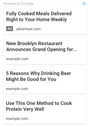
If you want to load your ad unit faster and grab visitors attention, then this “text only” ad unit with card will work flawlessly.
data-matched-content-ui-type="text_card"

data-matched-content-rows-num="4"

data-matched-content-columns-num="1"
Here we have selected 4 rows and 1 column to specify the number of rows and columns in your Matched content unit.
Bonus! Time freshness settings to your Matched content units
This is an additional setting, which will enable you to control your matched content recommendations. This feature’s name is Time freshness. This feature will enable you to show either recent post only as recommended post or all previous and new posts from your blog randomly.
To apply this setting please follow the below steps:
Step #1: Sign in to your AdSense account.
Step #2: Click Sites to expend options from left menu and select “Matched Content”.

Step #3: Click right arrow to change setting of your eligible site.
Step #4: You will see “Time freshness” option and click on it to expend and Select “Any time” or “Most recent”
By default “Any time” will remain selected but if you select “Most recent” then the service will activate and display your most recent article in Matched content ad unit.
Conclusion
Matched content units are suitable for websites with longer content pages. If your site is containing in-depth articles with landscape image then this will work flawlessly. Many blogger don’t use matched content, because of less control over ad unit but now user has much control to adjust this free recommendation tool.
AdSense team has improved it to make compatible with all types of websites but still we have less control over image.
Those who are using portrait size image they will face little trouble, because this tool still unable to crop portrait size image appropriately.
Those who are using portrait size image they will face little trouble, because this tool still unable to crop portrait size image appropriately.
If you are facing any minor problems in your matched content then by following things you can overcome from it. Such as
- Keep the post title short and within 56 characters.
- Use Open graph Meta tag on your web page.
- Choose 4 recommendations in single column and for over 6 rows use 2 columns.
- Select maximum 30 rows in ad unit.
Learn How to add Open Graph Protocol Meta Tags? Please visit below article.

2 comments
There are many ways you can make money online. Blog monetization with ads is one of the easiest method to make money online.
A blogger at beginners level use Ads Network to earn money. But most of the publisher do a mistake about their earnings, because they don't use High CPM keywords.
If you use High CPM keywords your earnings will automatically increase. And this tactics works best with Google AdSense.
Not everyone is creative. If you are creative enough then you can create your own digital product and sell through your website.
the problem is people don't want to buy from brand new site. So you must gain popularity first and build your email list then you can start selling.