Top 15 Fonts To improve Blogger User Interface (UI) Typography and Design
Do you have a website or a blog?
It is very tough to recognize the value of your blog's user experience. Maybe your blog is full of interesting content but has some unknown issues. And your readers are skipping your blog without reading the whole content. As a result, the bounce rate is increasing every day.
This problem may arise from the readability issue. In simple terms, "readability" refers to how convenient or fun it is to read something in your blog.
The readability of your blog will determine whether or not you attract followers, readers, clients, and more content shares.
Fonts are undeniably one of the most significant facets of user interface design. A user interface's performance or loss relies on it. You may drop your users right away if they are unable to read your content.
That's why, even though you just have a basic knowledge of typography, you should figure out the fonts are better for a website on your own.

What is the User Interface (UI) Typography?
It is a visual representation of text with a range of typefaces, weights, dimensions, scales, colours, and styles. When you visit a webpage then you can see different types of fonts in a vibrant style.
- A typeface family is 'Source Sans Pro',
- A typeface weight example is 'Source Sans Pro' bold, italic or font-weight:500; font-weight:700;
- A typeface size can be specified as font-size:12px.
- Fonts come in a range of designs for users.
Regardless of the fact that the user interface (UI) design is a more proven and well-known field. But the debate persists on "What is user interface design?".
The UI design refers to the look, appearance and interactivity of a product are all aspects of user interface design.
“UI is the saddle, the stirrups, and the reins. UX is the feeling you get being able to ride the horse.”— Dain Miller, Web Developer
It entails carefully analyzing any visual and interactive feature the user can come across. As to typography and colour schemes, spacing, Icons, buttons, illustration, and responsive design are all things that a UI designer considers.
What Should be Considered for Selecting a Font?
- How many different weights does the font come in?
- Is the x-height impacting readability?
- Is this font scalable across a variety of devices?
- Is it obtainable?
- What is the contrast ratio of the font?
Top 15 Must-have UI/UX Fonts Hand-picked specifically with designers in mind.
- Roboto
- Playfair Display
- Montserrat
- Poppins
- Nunito Sans
- Open Sans
- Source Sans Pro
- Lato
- Noto Sans
- Lexend
- Raleway
- Arimo
- Proxima Nova Font
- Helvetica Neue
- Gotham
A# Best 10 Free Fonts for Typography, UI, UX and Mobile App Design
01. Roboto Font
This is the official Google font for Android, Google's smartphone operating system. This font has become very prominent among designers as a replacement of Arial and Open Sans due to its popularity.
Roboto is a font with two identities. Which has a mechanical skeleton and is mostly geometric in shape.
 |
| Roboto typeface examples in website |
The font has friendly and inclusive curves at the same time. Roboto doesn't sacrifice, allowing letters to be settled into their typical width, unlike certain grotesques who bend letterforms to impose a rigid rhythm. This creates a more smooth reading rhythm, which is more popular in serif and universalist fonts.
02. Playfair Display Font
This font is often used as a title or headline because it stands out and grabs attention. It also gives the designs a timeless and sophisticated feel.
 |
| Playfair Display typeface examples in website |
The Playfair font architecture has a transitional style. In the late 18th century during the European Enlightenment, broad nib quills were replaced by pointed steel pens as the common writing instrument of the day.
Playfair font is the digital form of that old writing instrument. With the advancements in printing technology, pigment, and paper production, this font became possible to print high-contrast letterforms with fragile hairlines that were becoming gradually dissociated from the printed letterforms.
03. Montserrat Font
 |
| Montserrat typeface examples in website |
It's a popular font in e-commerce and fashion app designs because it's a little thick but crammed with casual typography.
But it's not really as clean as Nutino Sans, a few customizations in each letter will make your UI more appealing.
04. Poppins Font
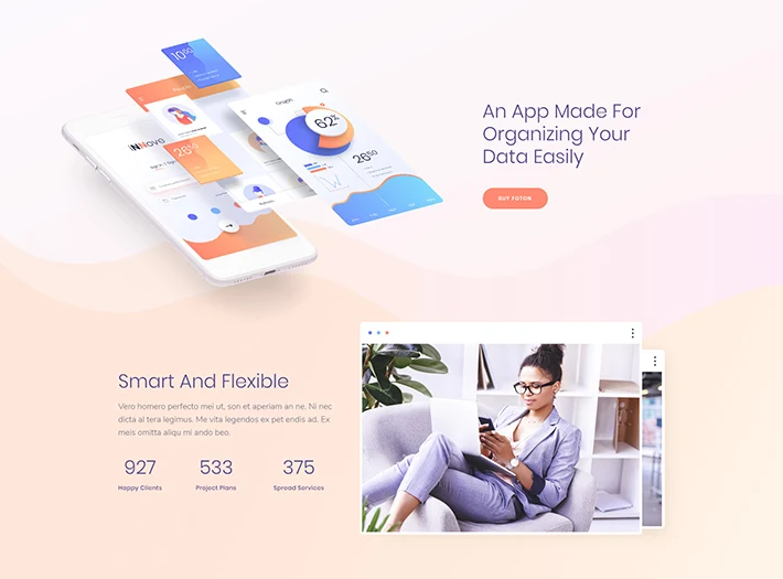 |
| Poppins typeface examples in website |
This font is more often commonly used in web design and smartphone applications, often in tandem with Roboto, Open Sans, and PT Serif. Poppins font designed by Jonny Pinhorn, Indian Type Foundry.
Their clients are tech giants like Apple, Google, Sony and many other international brands. It has 18 styles to use as display or body font. The best pairings of this font with Open Sans, Source Sans Pro, Roboto Slab and Lato font.
05. Nunito Sans Font
This font has a very sleek shape, and it would look much cleaner if the letter spacing is enlarged.
Nunito is a well-balanced sans serif typeface family that comes in two variations:
Nunito: This is a rounded radial sans serif for display typography designed by Vernon Adams. He has taken the initial step for the project.
 |
| Nunito Sans typeface examples in website |
Nunito Sans: Jacques Le Bailly improved it to include a complete range of weights as well as Nunito Sans, a standard non-rounded terminal variant.
06. Open Sans Font
This font is almost remarkably similar to Roboto, with only minor differences in some characters.
 |
| Open Sans typeface examples in website |
It is typically used for web design, while most UI designers prefer Roboto for mobile apps, particularly for the Android operating system.
07. Source Sans Pro Font
Paul D. Hunt created Adobe's first open-source typeface family, Source Sans Pro. It's a sans serif font designed for use in user interfaces. Under this font family, 12 style font is available.
 |
| Source Sans Pro typeface examples in website |
08. Lato Font
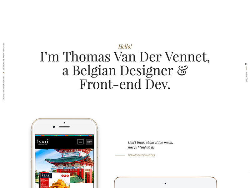 |
| Lato typeface examples in website |
Lato is a font designed by ukasz Dziedzic. He is a graphic designer from Poland. Lato means "Summer" in Polish. Originally designed for business use, this font is now available for free to all.
Its friendly feel makes it ideal for use as a paragraph font; DM Serif, Merriweather, and Lustria are the best combinations for this font.
09. Noto Sans Font
 |
| Noto Sans typeface examples in website |
It is implied and appears in Regular, Bold, Italic, and Bold Italic types. It is a descendant of Droid, and it, like Droid, has a serif sibling family named Noto Serif.
10. Lexend Font
The Lexend fonts are designed to enhance the reading experience by reducing visual stress. Created with dyslexia and reluctant readers in mind. Bonnie Shaver-Troup is the Lexend project's founder, later he realized that these fonts are also useful for everyone else.
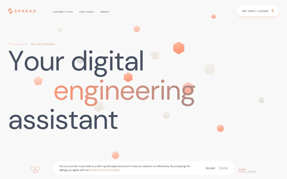 |
| Lexend typeface examples in website |
The first collection of Thomas Jockin's Lexend fonts (Deca, Exa, Giga, Mega, Peta, Tera, Zetta) all have a 'Medium' weight, and each gets wider and more freely spaced as the weight increases.
11. Raleway Font
 |
| Raleway typeface examples in website |
Raleway is a trendy sans-serif font family. Matt McInerney engineered it as a single thin weight initially.
12. Arimo Font
Steve Matteson crafted Arimo as a sleek, vibrant sans serif that is metrically aligned with Arial.
 |
| Arimo typeface examples in website |
Arimo meets the needs of developers searching for width-compatible fonts to support document usability across platforms by offering better on-screen readability features and the pan-European WGL character set.
B# Best 3 Paid Fonts for Typography, UI, UX and Mobile App Design
13. Proxima Nova Font
Proxima Nova is an entirely remodelled edition of Proxima Sans 1994. It has a total of 48 OpenType fonts with complete functionality. Proxima Nova is a typeface that falls somewhere between Futura and classic sans faces in terms of style.
 |
| Proxima Nova typeface examples in website |
Price: $5.29 per style and the total bundle price for Desktop is USD 550.50. But if you want to purchase for the website then USD734 (500,000 page views per month) but prices may change over time
14. Helvetica Neue Font
Thanks to Stempel and Linotype's marketing campaign for this remarkable font. This typeface was developed at the Haas'sche Schriftgiesserei by Max Miedinger and other project team members. It has become one of the most prominent and influential typefaces in the world.
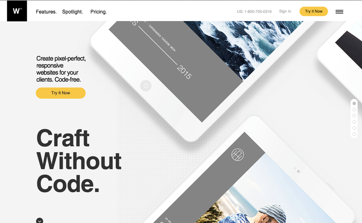 |
| Helvetica Neue typeface examples in website |
It's integrated into a variety of printers and operating systems. For the Linotype method, Helvetica's initial letterforms had to be adjusted. Helvetica was extended over time to incorporate a number of weights, but they were not aligned with one another.
Price: Euro 45 per style and Total package price are Euro 399. But prices may change over time.
15. Gotham Font
Gotham is the strangest of designs: a brand-new typeface that looks and sounds eerily familiar. Gotham adopted an authentic style from the lettering that inspired it. It is persuasive but never intimidating, pleasant but never bluesy, optimistic but never standoffish.
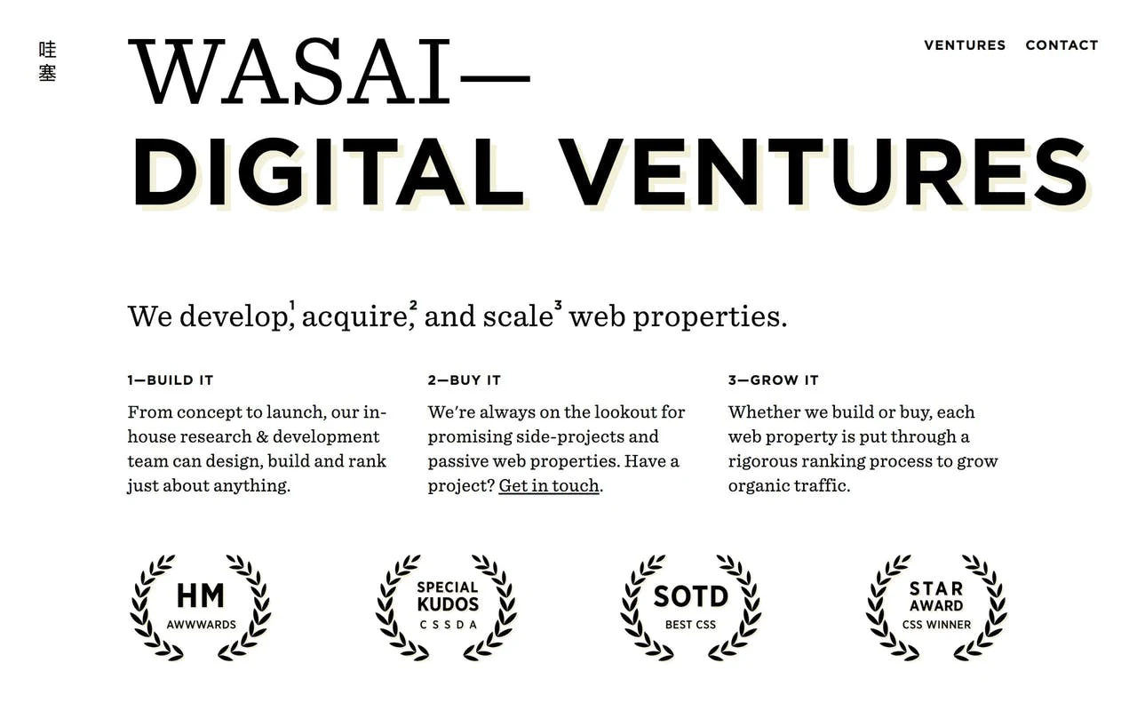 |
| Gotham typeface examples in website |
The incorporation of too many novels features that have never been used before. The lowercase, italics, a wide variety of weights and widths, and a character collection that goes beyond the Latin alphabet. It elevates the plainspokenness of these types and introduces a vast range of articulate identities to the Gotham family.
The price is a bit expensive and starts at $169 per Pack. However, the prices may change over time
How to Test the Font for your Website?
Designing a website is cumbersome and appropriate font selection is more complex. Before web design, you can test custom and Google Fonts in your designs in Justinmind's mockup tool.

How to install UI font In Blogger Theme?
@font-face{font-family: 'Noto Sans';font-style: italic;font-weight: 400;font-display: swap;src: local('Noto Sans Italic'), local('NotoSans-Italic'), url(https://fonts.gstatic.com/s/notosans/v11/o-0OIpQlx3QUlC5A4PNr4ARMQ_m87A.woff2) format('woff2'), url(https://fonts.gstatic.com/s/notosans/v11/o-0OIpQlx3QUlC5A4PNr4DRG.woff) format('woff')}
@font-face{font-family: 'Noto Sans';font-style: italic;font-weight: 700;font-display: swap;src: local('Noto Sans Bold Italic'), local('NotoSans-BoldItalic'), url(https://fonts.gstatic.com/s/notosans/v11/o-0TIpQlx3QUlC5A4PNr4Az5ZuyDzW0.woff2) format('woff2'), url(https://fonts.gstatic.com/s/notosans/v11/o-0TIpQlx3QUlC5A4PNr4Az5ZtyH.woff) format('woff')}
@font-face{font-family: 'Noto Sans';font-style: normal;font-weight: 400;font-display: swap;src: local('Noto Sans'), local('NotoSans'), url(https://fonts.gstatic.com/s/notosans/v11/o-0IIpQlx3QUlC5A4PNr5TRA.woff2) format('woff2'), url(https://fonts.gstatic.com/s/notosans/v11/o-0IIpQlx3QUlC5A4PNb4Q.woff) format('woff')}
@font-face{font-family: 'Noto Sans';font-style: normal;font-weight: 700;font-display: swap;src: local('Noto Sans Bold'), local('NotoSans-Bold'), url(https://fonts.gstatic.com/s/notosans/v11/o-0NIpQlx3QUlC5A4PNjXhFVZNyB.woff2) format('woff2'), url(https://fonts.gstatic.com/s/notosans/v11/o-0NIpQlx3QUlC5A4PNjXhFlYA.woff) format('woff')}
.Blog .post-entry h1, .Blog .post-entry h2, .Blog .post-entry h3, .Blog .post-entry h4, .Blog .post-entry h5, .Blog .post-entry h6{
font-family: 'Noto Sans', sans-serif;
margin:1.7em 0 20px;
line-height:1.4em
}
body{
position:relative;
margin:0;
padding:0!important;
width:100%;font-family:'Noto Sans', sans-serif;
font-size:14px;
color:#48525c;
background-color:#fafafc;
-webkit-font-smoothing: antialiased
}
Font Polishing Method
.widget .title, .comments .title {
font-family: 'Noto Sans', sans-serif;
font-size: 15px;
padding-left: 8px;
line-height: 1.8em;
letter-spacing: .03em;
color:#48525c;
text-transform: uppercase;
-webkit-font-smoothing: antialiased
}- font-size: 15px; (For changing the font size)
- letter-spacing: .03em; (If your font is compact then you can add this code for making the looks clean.)
- line-height: 1.8em;(By changing the numerical value you can make more space between text line)
- text-transform: uppercase; (This code will capitalize all text)

6 comments
Thanks Tania